
You, too, can create a brand style guide that takes your company’s visual identity to new heights. Whether you’re a small business or a corporate powerhouse, this guide will help you craft a coherent and captivating brand presence.
You know that a consistent and cohesive brand is key to success. Your visual identity conveys your brand message to the world. An effective marketing strategy ensures that every expression of your business – from your website to your product packaging and social media – aligns with your core values.
In this article, we explore some of the most compelling brand styles from leading companies. You’ll gain insights into how to define and communicate your visual brand through key elements like color palettes, typography, logos usage guidelines and visual motifs. With the right brand style, you can achieve visual harmony across all your marketing channels and connect with your audience in an impactful way. The examples we cover are sure to inspire you.
FAQs: Common Questions About Developing An Effective Brand Style Guide
What is the purpose of a brand style guide?
A brand style guide establishes guidelines for how your brand will be represented visually across all marketing channels. It helps ensure brand consistency and a cohesive customer experience. Some of the elements it specifies include:
- Your brand’s color palette and proper color usage
- Typography (fonts, sizes) for headings and body copy
- Guidelines for using your logo, including minimum size, exclusion zone and improper usage.
- Visuals like photography style or iconography
- Voice and tone standards for copywriting
Who develops the brand style guide?
A company’s marketing team generally develops the brand style guide, often with input from the design and product teams. It should be a collaborative process to establish standards that all teams can get behind and commit to upholding.
When should we create a brand style guide?
It’s best to develop your brand style guide as early as possible in the branding process, ideally before launching a new brand or rebranding. This establishes brand consistency from the start. However, it’s never too late to create a guide to strengthen your brand identity.
How detailed should our brand style guide be?
The level of detail in your guide depends on your needs and resources. For a small company, a shorter guide with the basics may suffice. Large companies often require highly detailed multi-page guides. As a rule of thumb, be as thorough as needed to give your teams the direction they require, while also being as concise as possible for ease of use and understanding. You can always add details in the future.
Where do we distribute and store the brand style guide?
The final brand style guide should be distributed to all internal teams and external agencies involved in marketing your brand. It’s best practice to store a master digital copy in a shared folder along with your brand assets. You’ll also want to provide a physical printed copy for easy reference. Be sure to keep all copies up to date when changes are made.
What Are Brand Guidelines?
Brand guidelines are like a set of rules that a business creates to showcase itself to the public. They cover important aspects such as colors, fonts, voice, and design. By sticking to these guidelines, businesses ensure that their branding remains consistent, allowing customers to enjoy a uniform experience when engaging with the company.
Before you jump into the nitty-gritty of design, it’s crucial to define your brand’s mission statement and understand your target audience inside out. These strategic elements are the building blocks for your brand style guide and will set you up for success.
Don’t settle for the ordinary. Elevate your business with impeccable visual guidelines that will leave a lasting impression.
Brand Guidelines Mission Statement
At the heart of your brand style guide lies a powerful tool: your mission statement. This action-oriented proclamation serves as the compass, charting the course of your organization.
Your mission statement acts as a guiding force regardless of the type of content you’re creating. Whether it’s engaging blog posts and captivating paid content or persuasive ad copy and visually stunning media, it ensures every element resonates with your brand’s purpose.
There are numerous ways to incorporate your mission statement into your brand style guide. You can seamlessly integrate it within the guide itself, create a separate document for easy reference during the creative process or distill its essence into a powerful slogan.
When you fully embrace the power of your mission statement, it becomes the driving force behind your brand style guide. It adds purpose and unity, leading to an extraordinary company identity that deeply connects with your audience.
Brand Guidelines Buyer Persona
A buyer persona plays a vital role in shaping a business’ content creation process. It serves as a guiding force, helping businesses understand their target audience better and tailor their content to meet their specific needs and preferences. By developing a detailed buyer persona, businesses gain insights into the demographics, behaviors, and motivations of their ideal customers.
To assist businesses on this journey, marketing agencies provide valuable services that include crafting a consistent and captivating style guide. This style guide solidifies the brand’s identity, ensuring that all content produced aligns with the brand’s values and resonates with the target audience. With a well-defined style guide, businesses can maintain a compatible and recognizable brand image across various marketing channels and platforms.
By utilizing these services, businesses can enhance their content creation efforts and effectively communicate their message to the right audience. The result is content that engages and resonates with customers, ultimately driving better outcomes and building lasting relationships with the target market.
Choosing The Right Color Pallete For Your Content Marketing
A color palette is like a handpicked collection of colors specifically chosen for a graphic. It typically includes a main color, along with lighter or darker shades of that color, as well as contrasting accent and text colors. This well-coordinated set of colors brings harmony and visual balance to the graphic, making it visually appealing and engaging to the viewer.
Developing a brand’s color palette is a crucial aspect of building a strong, visual identity. The right choice of colors can communicate a company’s values, evoke specific emotions and leave a memorable impression on the audience. Here are some important tips to keep in mind when developing your brand’s color palette:
- Align With Brand Values And Persona: Choose colors that reflect and reinforce your brand’s core values and personality. Consider the emotions and associations each color conveys and select those that resonate with your target audience.
- Utilize Color Symbolism: Colors carry symbolic meanings that can influence how people perceive your brand. Leverage color psychology to elicit the desired emotional response from your audience. For example, blue may convey trust and reliability, while red can evoke passion or urgency. Understand the cultural and contextual associations attached to colors to ensure effective communication.
- Maintain Cohesion: To create a compatible color palette, limit the number of primary colors you use. Choose a set of main colors that work well together and represent your brand accurately. Then, use variations like lighter tints, darker shades and accents to add depth and versatility while staying within the defined color scheme.
- Create Consistency Across Channels: Apply your color palette consistently across all outgoing content. Whether it’s your logo, website, social media graphics, packaging or advertisements, maintaining a unified color scheme helps strengthen brand recognition and recall.
- Balance Contrast And Harmony: Color contrast can be used strategically to create visual interest and draw attention to key elements. However, it’s important to strike a balance between contrast and harmony. Too much contrast can create visual clutter, while too little may result in a lack of visual impact. Experiment with contrasting colors when creating your color palette.
- Consider Accessibility: Accessibility is a crucial aspect of color selection. Ensure that your color choices meet accessibility guidelines, particularly when it comes to sufficient contrast between foreground and background elements. This consideration makes your brand more inclusive and allows individuals with visual impairments or color vision deficiencies to engage with your content.
Examples Of Color Palettes That Pop
To build an effective brand, choosing a distinct, effective color palette is key. Colors are highly symbolic and directly impact how people perceive your brand. The following examples demonstrate impactful color choices:
- The tech giant Apple is renowned for its minimalistic, sleek style. Their brand color palette focuses on metallic colors like silver, space gray and gold to convey a sense of sophistication. The selective use of bright pops of color, like the Apple logo, draws attention and creates visual contrast.
- The cosmetic brand Glossier built a cult following using a muted color palette dominated by millennial pink. The soft, blush tones project a warm and approachable brand image that resonates with their audience. The consistent use of pink throughout their marketing reinforces their brand identity and the overall tone of the company.
- The fitness brand Nike is all about empowerment and pushing boundaries. Their bold color palette is dominated by bright oranges and reds that evoke energy and motion. The dynamic use of gradients and overlays in their visuals brings their marketing to life. The memorable swoosh logo in energetic oranges and reds is immediately recognizable by most audiences.
How Font And Typeface Shape Brand Voice
Selecting typography that aligns with and reinforces your brand voice is essential to creating a balanced visual identity. The fonts and typefaces you choose should resonate with your target audience and evoke the right tone and personality.
For an elegant and sophisticated brand, serif fonts like Garamond, Baskerville or Bodoni convey tradition and luxury. Tech brands often use clean, minimal sans-serif fonts such as Futura, Helvetica or Avenir to exude a sleek, innovative esthetic. More casual brands may opt for script or handwritten-style fonts to seem friendly and personal. It’s common for businesses to choose both a serif and a sans-serif font – one used for primary text (headlines) and the other for subtext (body copy). Just be sure there is enough contrast between sizes and styles, so the content remains readable.
Consider the primary marketing channels you use and how different fonts may appear across print, digital and social media. Test different options to determine what is most legible and impactful for your needs.
Once you have selected your brand fonts, be consistent in their use. Establish clear guidelines for font sizes, capitalization, kerning or letter spacing and any acceptable alternatives. Your visual style guide should provide specific examples of properly executed typography for all relevant marketing materials.
By taking a strategic approach to selecting and using brand typography, you have the opportunity to create a unique voice that truly connects with your audience. This fosters a sense of familiarity, loyalty and trust in your brand. Remember, the fonts you choose have a powerful impact, so it’s important to ensure they effectively convey the desired message.
Creating A Recognizable Logo
When it comes to brand guidelines, don’t overlook the power of your logo. It may seem simple, but it’s a vital and intricate part of your brand. In your comprehensive guide, your brand should showcase your logo visually, delving into its design details and explaining how both internal and external publishers should use it. Don’t forget to include examples of wrong usages, like rotating or curving the font, to ensure consistency across all platforms. For well-known brands, consider creating a separate document outlining the acceptable use policies for your logo. Remember, a strong logo can make a lasting impact on your marketing efforts.
Imagery And Iconography
When creating your brand guidelines, don’t limit yourself to just including your logo, colors and fonts. To develop a stronger style guide, consider incorporating approved imagery, pre-designed icons and custom symbols that perfectly represent your brand. If you’re working with a smaller budget, you can also suggest different photographic styles, such as candid or staged, and direct content creators to your preferred stock photo provider, like Shutterstock or Unsplash. Another option is to organize a company photoshoot in a studio and make the resulting photographs available for creative use.
Style Guide Examples
-
Walmart
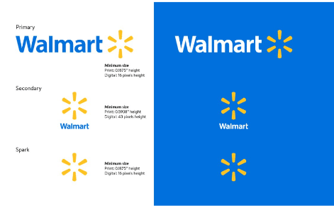
Leveraging the power of consistency and harnessing the emotional connection to their iconic color helps unleash the full potential of Walmart as a global brand.
Walmart, a heavyweight among brands, doesn’t disappoint when it comes to its meticulous brand guide. The organization covers everything from their logo, photography, typography, illustrations and iconography to their voice and editorial style. Let’s not forget about “Walmart Blue,” the backbone of their brand identity.
See the full brand guide here.
-
Skype
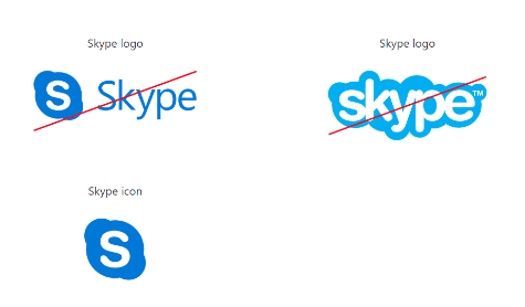
Skype does not allow tweaking the colors, angle, dimensions or even the relationship between elements.
Skype, the beloved video chat platform now owned by Microsoft, not only offers seamless communication but also boasts a squeaky-clean style guide for its brand. This comprehensive guide covers everything from product phrasing to strategic logo placement. Marketers, take note!
See the full brand guide here.
- Starbucks
As the brand evolved, the logo followed with a fresher, more modern look. One thing stayed the same though: the mermaid.
Starbucks’ logo history is a captivating tale intertwined with literature and legends. Speculations and conspiracy theories have brewed around its hidden meanings, ranging from Illuminati connections to menacing Zionist plots. However, the truth behind this iconic logo is much more pedestrian. The logo symbolizes a nautical allegory, likening Starbucks to the enchanting sirens of ancient lore, enticing coffee lovers from all corners of the world.
Over the years, the Starbucks logo has undergone some transformations. With these subtle tweaks, Starbucks achieved a timeless logo that pays homage to its past while embracing the present. And now, coffee enthusiasts worldwide recognize this emblem as a symbol of quality and a welcoming call to indulge in the rich Starbucks experience.
See the full brand guide here.
-
I Love New York
Despite its famously simple t-shirts, I Love New York has a brand style guide. The company begins its guidelines with a thorough explanation of its mission, vision, story, target audience and tone of voice.
See the full brand guide here.
-
TikTok
TikTok’s style guide isn’t just a guide — it’s an interactive brand book. First, it provides an in-depth look into how it brings its brand to life through design. Then, it gives an overview of its logo, co-branding, color and typography. At its core, TikTok is a company that “celebrates the relentless energy, creativity and expression of its users.
See the full brand guide here.
Conclusion
As a marketer, building an effective visual brand is essential to connecting with your audience and standing out in a crowded digital landscape. A comprehensive brand style guide is the foundation for crafting a cohesive visual identity and maintaining consistency across marketing channels. Reviewing examples from leading brands is a useful way to gain inspiration and insights for developing your own guidelines.
With a well-designed style guide in place, you’ll be equipped to produce impressive and engaging content that amplifies your brand message and forges meaningful relationships with your customers. By thoughtfully considering color, typography, logo usage and other visual elements, you can craft a style guide that becomes a vital resource for your marketing team and partners. The key is creating a guide as visually compelling as the brand itself.
Let Three Girls Media Help With Your Company’s Branding
Bringing your brand to life and keeping it consistent across all platforms is no small feat. But fear not, Three Girls Media is here to help! We’ve got the expertise, design know-how and communication skills to develop your brand’s style guide and elevate your business.
Get in touch with us for a complimentary, 30-minute phone consultation with our CEO, Erika Taylor Montgomery. where she’ll provide her professional insights into the specifics of your business. Together, we can unleash the true potential of your brand.
Special Offer:
Sign up for a complimentary consultation during January and receive an Email Marketing Guide valued at $475! We offer a 30-minute phone consultation with our CEO and can answer your questions and discuss your specific marketing needs – no strings attached. Call 360-955-1410 or contact us today to arrange your consultation!